What is one of the most essential aspects of our perception of the world? Surely it must be color. There are millions of colors that the human eye can distinguish, and each of them can set a different mood. When it comes to building a website, you cannot underestimate the power of web design color combinations.
According to multiple sources, a key reason why visitors go to a website to never come back is due to poorly chosen color schemes. Other sources confirm that color enhances brand recognition, which, in turn, links directly to consumer confidence in your business. Keep this in mind if you want to build an online store, and the time comes for you to decide on a website color scheme.
However, if you pick your colors correctly, they can add a unique charm and artistic touch to the website. It is not only soothing and appealing to the users’ senses, but it also improves user experience across the board. If you read our guide on picking logo color combinations, you already know a few things about color schemes. The lessons there are valuable and transferable to creating landing pages or even entire websites.
We’ve put together a collection of five websites using aesthetic color schemes and combinations to help you with your next web design project. After looking through the examples, you can check out our short guide on choosing color combinations for your website. There are no dogmatic rules for selecting the right web design colors, yet some of the main principles are a good place to start.
5 Web Design Color Combinations for Your Inspiration
In this section, you will see some websites with fantastic color combinations to get your inspiration going. As a design hack, we also added the main color codes of these websites, so you have a solid starting point.
TEAM GEEK
This design-led technology studio knows plenty about building a brand’s image, product development, and market activation, among others. The dominant color chosen by Team Geek is black and, according to color psychology, it suggests sophistication, security/safety, a bit of dramatism, formality, and professionalism.

Color combination used:
- #d4d1cf
- #873f2d
- #171717
- #1e2223
Dark backgrounds and color schemes on your website can interfere with readability, so before you choose black as the dominant color, make sure it will not affect users’ experience with it. A dark background offers your website an elegant look and makes the content stand out clearly. It encourages you to use contrasting elements and colors. As we said, black is THE color of sophistication; you can use it to build a website, create a logo, or make an online demonstration of your products and services.
HELLO STUDIOS
If color and fonts spark your interest, then you should check out the Hello Studios website. Everything from the background to the CTA buttons compels users to learn more and seamlessly engages them with the brand.
You will undoubtedly notice the website fonts they used – catchy and intriguing. As colors go, orange is vibrant and inviting, elegant yet playful. Perfect for a web design company, eCommerce stores, technology, healthcare, and so on.
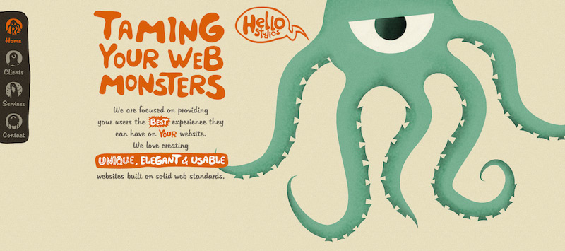
Color combination used:
- #E4DBBF
- #DC5B21
- #70AB8F
- #383127
Looking at this infographic on the psychology of colors in web design, you will learn that orange inspires enthusiasm, ambition, and confidence. The green elements add a touch of harmony to the whole picture, inducing a state of balance.
BOOKS AT WORK
As website color schemes go, orange convinces users to engage in an action, while the background is a canvas telling this NGO’s story. An interesting element – besides the color combination – are the graphics on this website, so don’t forget about the visual elements, as they are also a crucial part of the user experience.

Color combination used:
- #b6d8d5
- #061b33
- #c45238
- #84b0af
When you consider a theme color for a website, keep in mind that your website builder will offer plenty of choices for you to consider. Choose a website template with aesthetic colors that match your website’s purpose. Just keep in mind that vivid and contrasting colors on your CTA buttons (orange included) tend to convert more. For a more tailored approach, you might want to design your website with a professional to ensure the color scheme aligns perfectly with your brand's ethos.
NAMES FOR CHANGE
Besides the fascinating concept behind this brand, the color combinations are exquisite. We have mentioned the black background, but what about the other colors on the Names for Change website? The mix of orange, green, and purple simply pops and convinces users to check out what this business is offering.

Color combination used:
- #50355e
- #c45d37
- #2f9774
If you want to use purple in your website design, keep in mind it is a powerful color with a deep emotional charge. In our culture, we associate purple with tech companies like Yahoo! or gourmet products like Cadbury. Overall, when choosing your website template to feature dark background and purple color schemes, make sure you don’t trade readability or user experience for aesthetics.
YUMMY
The last entry on our list of web design color combinations is Yummy, a website template developed by our talented design team. As you can see, users benefit from contrast, joyful nuances, and high-resolution images abundant in fun colors. Together, they create a website with an equally appealing quality as the ice cream it promotes.
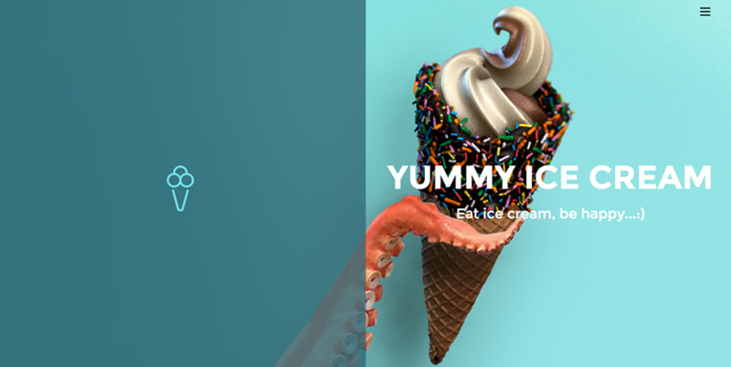
Color combination used:
- #6fe2ec
- #3a7d87
- #ffffff
Speaking of designers and templates, take a breather to check out what our pros have to say about website design in our contemporary times. You are guaranteed to learn a few extra tips and tricks on the spot.
How to Choose Color Combinations for Your Website
Now that we’ve gone through some compelling website color combinations to jumpstart your inspiration let’s go through a brief step-by-step guide on choosing the perfect color scheme for your website/online business.
1. Less is More
Never overdo! Though colorful websites can look vibrant and beautiful, they usually distract the visitor from the main content. A palette of 3-4 primary colors is the optimal solution for an aesthetic and user-friendly website.
2. Play with Contrasts
Contrasting colors and combinations can play a significant role in helping the user differentiate page elements from one another. Correct contrasts of backgrounds and texts and distinguishable colors of clickable links can make a website readable and more user-friendly. Contrasting color schemes are also a saving grace for users with vision problems and people using mobile screens and low-quality monitors.
3. Consider Color Psychology
Why are people more relaxed in green rooms? Why are "stop signs" red? While perceptions of different color schemes can be somewhat subjective, reactions to specific colors are also based on psychological feelings: green relaxes, pink is romantic, yellow is optimistic, etc.
Hence, certain colors can have a huge impact on how we feel and act, so considering color psychology while designing a website is crucial – especially for eCommerce websites, where the right colors can encourage more purchases and push the visitors to action.
4. Get Inspiration from Nature
When searching for inspiration, sometimes it’s better to log out of the Web and just look outside the window. Sometimes, the perfect color palettes are the ones created by Mother Nature. After all, making the right color palette choice or creating a color combination from scratch is still a big challenge. So, trust nature to tell you what to choose, especially when you want your overall website color scheme to induce a certain feeling or behavior.
5. Ask the People
Don't rely solely on your judgment when creating color combinations for your website. Make sure to ask several people what they think about the design and whether it's pleasant to the eye. What may look good to you may not look so good for others, and vice versa. Always welcome feedback and constructive criticism – they will help you in the long run.
If you want more inspiration for your website design and color schemes, check out some of the most interesting artists’ portfolios we found online. Look beyond color palettes, and pay attention to fonts, logos, visuals, interactive elements, website structure, etc. After all, if artists don’t know about the impact of color on peoples’ emotions, nobody does.
This short guide sums up the most important color combination tips needed to convert your visitors into customers. Don't hesitate to implement them on your website - starting from today! Just pick the main colors for your website, play with contrasts, and enjoy crafting your new website!
With that being said, the Ucraft design team has already created a wide range of stunning templates in different color combinations. Who knows, maybe you’ll find the ideal template for your website in just a couple of minutes?

