We've all seen those billboards on the street saturated with logos that somehow get stuck in our brains no matter where we go. You're probably remembering a couple of iconic logos right now: Starbucks, Mcdonald's, Nike, Chanel, and so on.
But have you ever considered the thought process behind these inescapable logo designs? Well, if you're a designer, you certainly have.
Picture this - you just got hired to design a eye-catching logo for a new brand. What's your go-to strategy? What is your own thought process behind creating an iconic, timeless logo? With that much pressure, it's easy to get stuck from time to time, which is precisely why the Ucraft Team is at your disposal with this article to set you back on the right track.
Let's dive into some tips and tricks from the Ucraft design team!
What Our Designers Have to Say
"Simplicity and Minimalism are My Go-To Tips"

Sona, our Art Director and lover of aesthetics, had the following advice:
"To be honest, when creating a logo, the most challenging thing is seeing the blank sheet in front of you and knowing that whatever you design on it will be used in all branding assets later on. That adds some pressure, right?
Before putting my pen on the paper, I always start by thinking through the story and concept behind the logo. Sometimes, just thinking about the brand's mission and identity helped me develop a logo overnight. Once you can picture how you'll visualize the mission and identity, you're halfway there.
What's left? Right, the visuals. People think that design is just about art and beauty, but they couldn't be more wrong. Good design is only possible by adding consistency and logic. The creation of the logo is the perfect example because once you've come up with the shape and form of your logo, you start playing around with the aesthetics. You see, it's both. And this is what makes it so exciting and challenging at the same time. You feel like you're breathing life into something inanimate, like a geometric shape, by using the power of creativity and balancing it out with the technical side. And then comes my favorite part - creative experiments with typefaces and colors to see which ones capture the brand's spirit most.
When it comes to logos, simplicity and minimalism are my go-to tips. I've been sticking with them for a while, and they seem to have never let me down. I do believe that these two are classics that never go out of style. As Dieter Rams once said: "Good design is as little design as possible." I couldn't agree more."
Need some inspiration? Ask AI
If you’re reading this article, you probably have enough design skills to not generate your logos with AI. But, even seasoned professionals need to draw inspiration from somewhere. So, why not check out Ucraft’s AI logo maker to get some design versions you can use as a starting point?
"Trends Come and Go"

Gayka, our graphic designer, also came through with an actionable plan:
"We never get a second chance to make a first impression. That's why it's essential to make your logo memorable and simple enough so that people easily recognize it even after one glance and remember it long after.
Whether I'm designing a logo that should give off a strong sense of authority or emanate more of a casual vibe, these are the steps I always follow:
Do your research
Remember we mentioned business essence and identity before? Study everything you can related to your client's business: the services they provide, the market in general, and their target audience. Checking out the competition will help you gain some strategic insight and see what could be your trademark's distinctive feature. Once you understand who your client is and what their needs are, you're all set to start the brainstorming process. Just sit and think about the color that pops into your head when you think of the company's mission, and do the same with the emblem and shape.
Build a mood board
Once I have my associations with the business, I move on to creating a mood board. To be honest, it can get pretty messy, just like my Figma projects (if you know, you know). I add everything that might convey the mood I need: color combinations, different shapes, fonts, movie posters, and sometimes even eye-catching pictures of food. You never know where you'll get your dose of inspiration from, right?
Create a sketchpad
Personally, I don't jump into making my logo colorful instantly. First, I make a black-and-white sketch, whether I feel like drawing it on paper and getting my hands dirty or making it in Adobe Illustrator or Figma. Only when I have my vector logo in monochrome do I start adding colors and other elements to it.
Keep it minimalistic
Sometimes just one symbol will do, so why go over the top? This year, liquid metal and hyperrealism are creating a lot of buzz, but I still prefer to keep it simple and minimalistic. Trends come and go, and you never know if the trend you used in your logo will be in vogue in a year or two. But, as Sona already mentioned, one thing always stands the test of time - minimalist design."
"Apart From Being Aesthetic, Your Logo Should Also Be Meaningful"

Graphic/Web Designer Nana also had some helpful tips up her sleeve:
"A logo is what helps your business stand out in our competitive modern environment. Though trends keep changing, every designer should stay up to date because some of them are there to stay. But don't make it all about trends; try to find the perfect balance between the new and the old.
There are some basic rules I always remember to stick to when creating a logo. First, make sure it's readable and clear; otherwise, it will just fall flat. Appearances do matter, and logos are no exception. A well-designed logo makes your brand more recognizable and can bring your trademark to the next level.
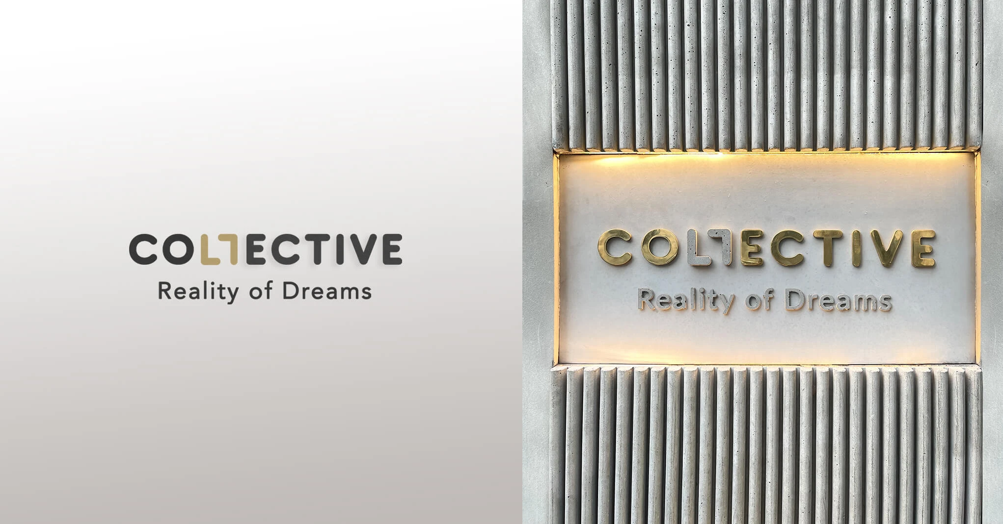
Apart from being aesthetic, it should also be meaningful. Think of the story behind the brand or its core mission. While working on one of my latest projects for Collective Group, understanding their mission helped me develop the logo. The brand's mission was to create a space where people would go, whether they feel like sipping some coffee, grabbing a drink, or having something to eat. And all this in one space. The two Ls facing each other represent the shared space they have created for three different establishments. Understanding the business's mission helped me craft a bold, meaningful, yet simplistic design."
Bottom Line
So, there you have it! A compilation of top tips from our wonderful design team. We hope you feel inspired and ready to tackle your current or future logo endeavors. If you still feel stuck, consider checking out the following resources:
What Makes a Good Logo: The Principles of Great Logo Design
Likewise, if you want to create a memorable logo for your business but have limited time and resources, why not give our free logo maker a try?

