A CTA (call-to-action) is important to trigger your online audience’s attention urging them to take certain actions while surfing your website. Catching your visitors' attention and making them click has some psychological factors to be considered. After all, psychology is behind everything we do, including the decision of when or where we place our action triggers.
In a world where people's attention spans are decreasing yearly, making your call-to-action messages stand out is becoming harder and harder. We meet CTAs everywhere, but how many of us really understand it?
If you want to learn how to create a call to action and what words to use to single out in the competition, follow along with this article.
What is a CTA Button?
A CTA (call-to-action) intends to make the site-visitor click and take action on your website. A compelling call-to-action involves two main elements: the design and the text. It can take the form of a button, a banner, an image, or text on your site. This button is an essential part of the inbound marketing process, transforming the user into a lead and then a customer.
You must have encountered expressions like "Buy now", "Click here", "Log in" and "Subscribe" on most websites. All these expressions aim to provoke an immediate, namely calling for an action. Usually, the CTAs include imperative verbs that create a strong sense of importance and urgency.
Whether you have an online store, a personal blog, a news site, or an online business idea that you want to develop, these action triggers are essential. To generate a strong CTA button, you need to identify its type and the vital elements that always catch users' attention. The words that you use can be more than "read more", "learn more", "access", "subscribe" or "buy". These expressions have indeed created a reflex in people's minds, but why not give them an even greater value? Let’s try to create a clear call to action.
Types of CTAs
As mentioned above the type of your CTA will determine the wording you should use. Depending on the profile of your website, there are 4 major types:
1. Newsletter subscription CTAs
2. Lead magnet CTAs
3. Social sharing CTAs
4. Learn more CTAs
Newsletter Subscription CTAs
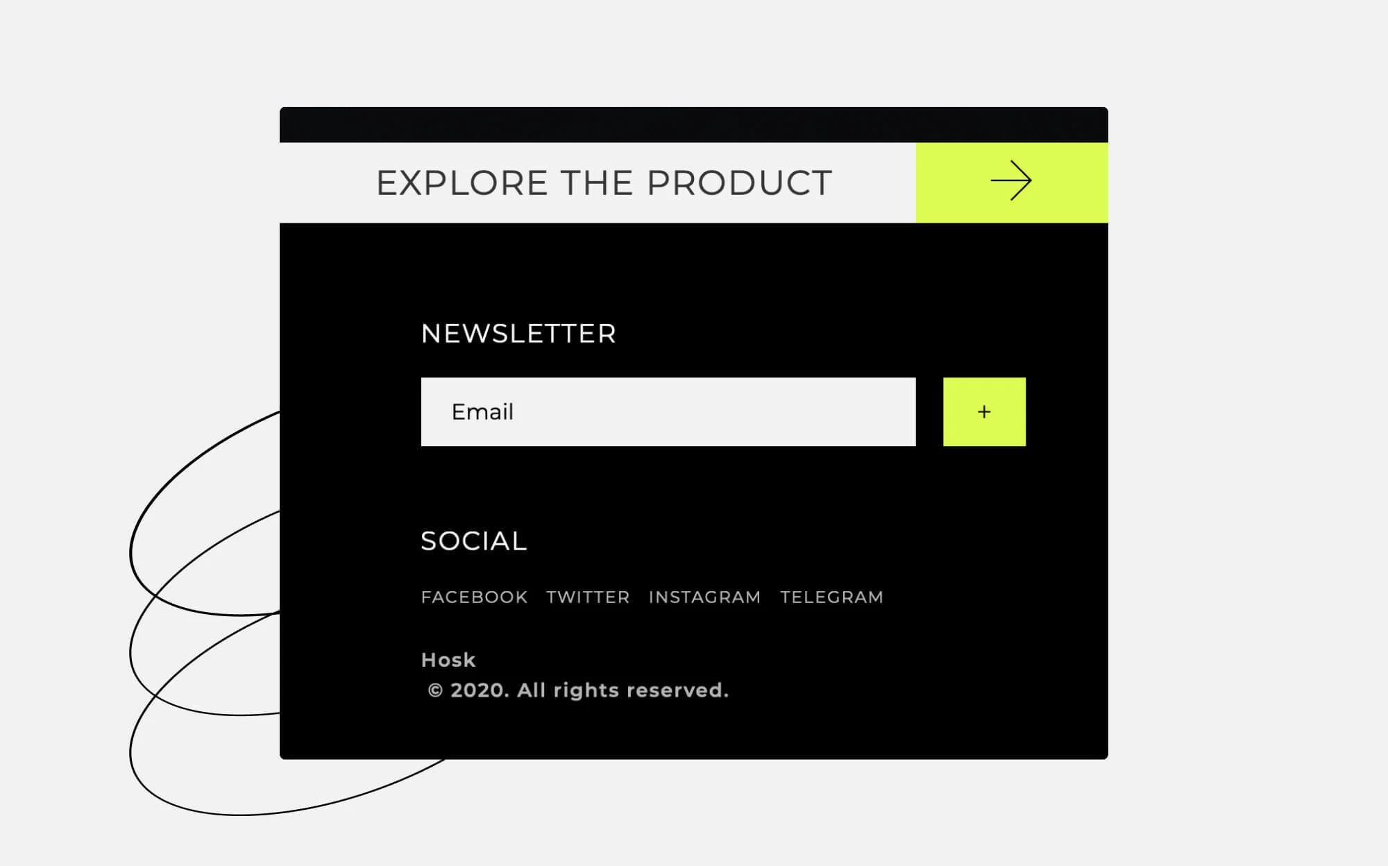
When your “product is a newsletter” what you want your reader to do is to subscribe to it. But, sometimes it isn't enough to just say "subscribe to my newsletter". You need to convince your visitors that they will receive valuable information, discounts, and promotions, once they have become your subscribers. Go beyond the customary. Risk it with a different tone of voice, use a catchy expression in a casual way, e.g. "Become a part of our community", "Join the fun", or "Ready for a great experience?". You need to stand out from your competitor and deliver original phrases that reflect the unique style of your website.
Lead Magnet CTAs
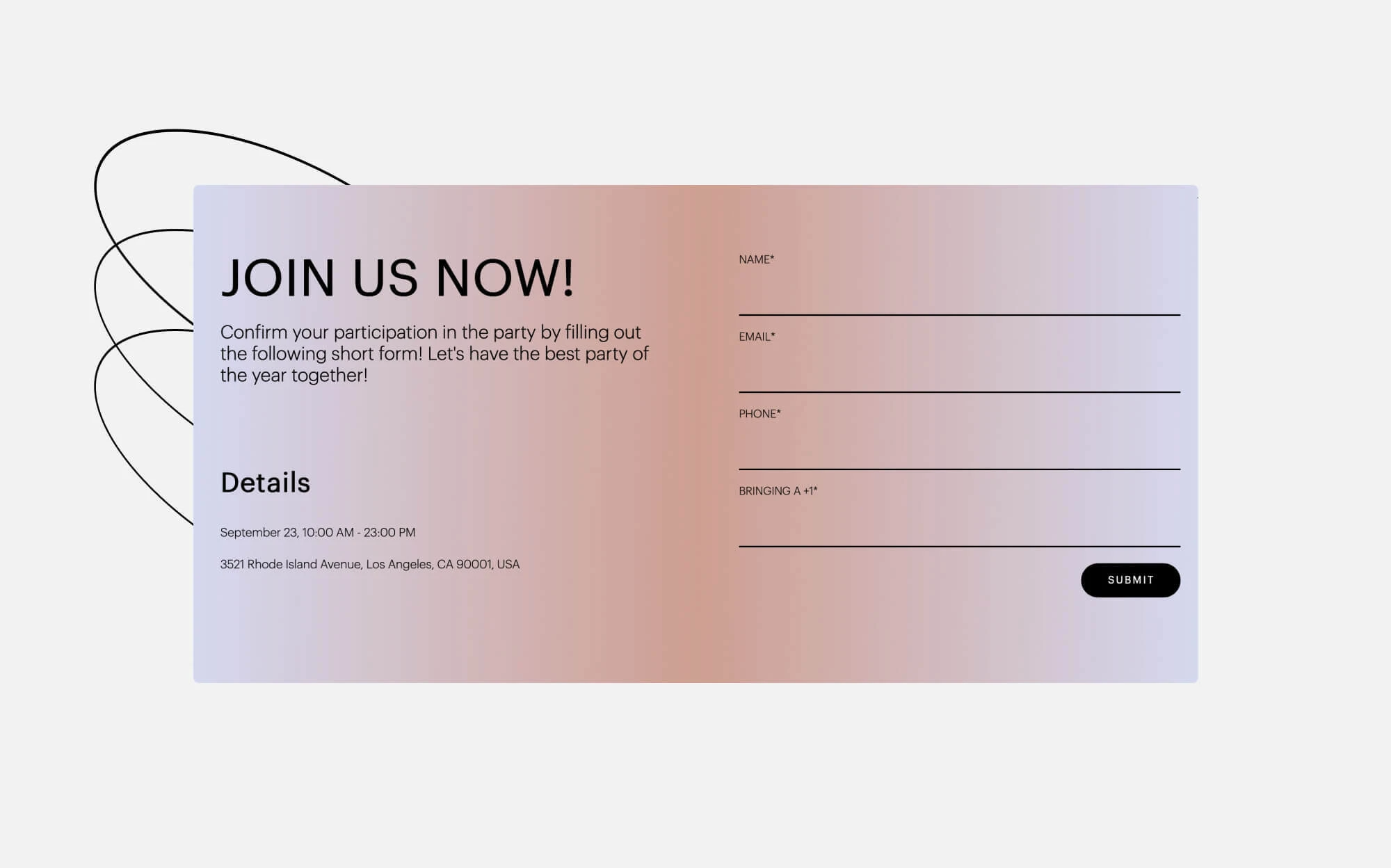
Lead magnets are the free gifts, the benefits you offer to your website visitors in exchange for their contact information. How does it work? You create a lead magnet that is short, valuable, and easy to use. Then you upload it on the landing page on your website or the homepage and offer it in exchange for the name, email address, phone number, or other data of interest. As the user gets interested in this gift, they click on the button. Remember: the lead magnet must solve a specific problem and come up with a valuable solution for your target audience. Ebooks, podcasts, checklists, video tutorials, and guides are some of the most common lead magnet ideas.
Social Sharing CTAs
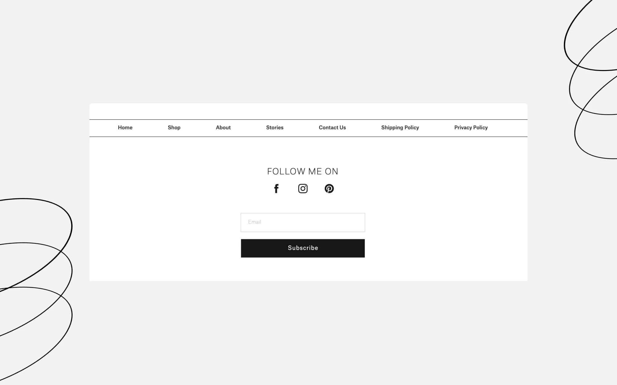
It's imperative to link your website to your social media pages. However, it's even better when social media platforms guide people to your website. Especially knowing that it's easy to set this up. Go to your Facebook business page and click "Add a button" from under the cover photo. There are many options to choose for your business. For example, if you have an online shop, then the best button for your Facebook page is "Shop Now". This CTA button will send your customers directly to your website from your social media account.
Learn More CTAs
You want the visitors to spend time on your website, create traffic, and eventually make a purchase. The "Learn more" button on your homepage will serve this purpose best. How to make best use out of it? Place them on your homepage, landing page, and other strategic spots, and if you think that "Learn more" is highly conventional or will not work for your purposes, try using expressions like "See in action", "Explore" or "Discover our experience".
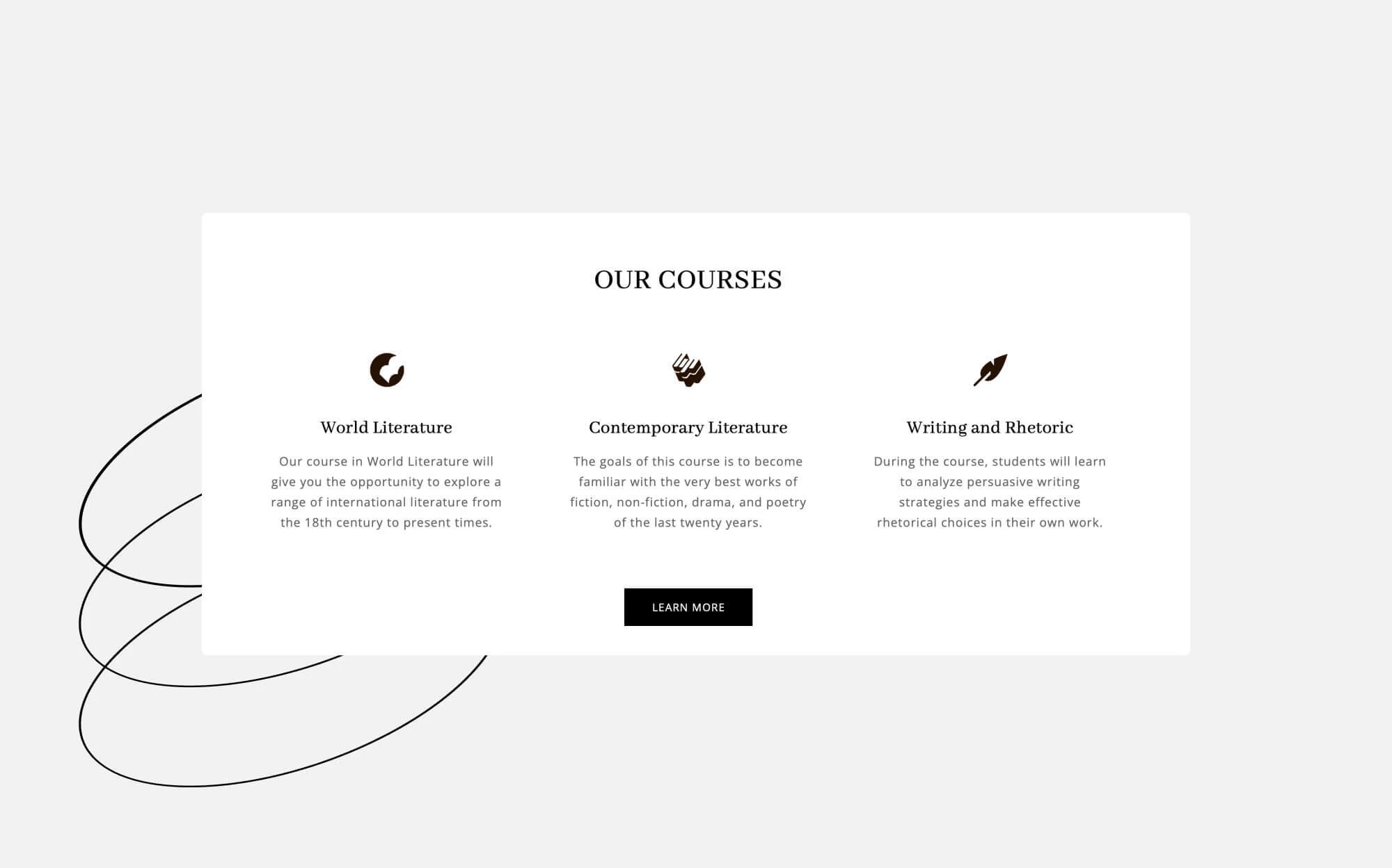
4 Elements to Include in Your Website CTA
All winning call-to-actions have some elements in common. Remember we spoke about psychology? The psychology behind the perfect call-to-action button is not merely the message, but also its physical appearance: text, color, shape, outline.
Here are the 4 most important features that you should consider:
1. Text / Word Count
The text on the call-to-action buttons is the most critical aspect. If you choose irrelevant words or long phrases, most likely, the results will be negative. One of the most important rules in copywriting is that "the first idea is never good because someone else has had it before." This applies to call-to-actions as well. Get creative to stand out from the crowd.
Best results are achieved by texts that:
• contain a verb – buy, download, subscribe;
• are addressed to the second person – find out, sign up, ask;
• imply urgency or fear of missing out (FOMO) – book now, get one of 30 copies, buy today;
• are clear and concise – try it for free, contact us, and get an offer.
Keep your CTA texts short, maximum 4 words, and don’t forget to use imperative verbs. Also, keep in mind that the number of characters should not exceed 15 characters. Here are some examples: buy, start now, take advantage of the offer, free download, enter the competition, sign up for free, enjoy discounts, etc.
2. Color
You can use light colors that attract attention, but these colors need to be pleasant to the eye. Research shows that the most preferred colors for the purpose are red, orange, green, blue, black, and gray. These colors should always be accompanied by text with letters of contrasting colors, that are both: visible and easy to read.
It's important to have a contrasting color with the rest of the image but within the limits of the used color palette. There are many color combinations for websites that can surely inspire you to choose the most suitable design of colors for your call-to-action buttons.
3. Shape
The call-to-action button must not be loaded with other graphical elements. Give it enough space to be spotted as easily as possible. You can choose a rounded shape or a button with square edges. The CTA design should match the shapes with your website's styling and layout. It should be attractive enough to convince as many visitors as possible to take an action and click on it.
4. Outline
The CTA button must be placed as centrally as possible, with blank space around it, so that it can be immediately spotted. You risk losing potential customers if you have other elements with similar shapes and sizes near the CTA. According to Google, the best place for a CTA button is "above the fold" of a page but closer to the bottom than the top of this area.
Once you've created a great CTA button, you can check our list of tips to improve your landing page, so that your website will generate more traffic and sales.
How to Create CTA Buttons on Ucraft?
Now that we’ve emphasized and recognized the importance of having outstanding call-to-action buttons it’s time to act. And no worries if you’re not a designer. As a website builder, Ucraft offers something that will help you make whatever CTA button you want with no design skills. Simply activate the designer tools and go to the UI Kit through your Ucraft account. Voila! Now you can make a real CTA by altering the message and setting up the trigger you prefer.
All set and ready to launch? Good! Keep in mind that it all takes practice. Do not stick to one CTA if you see that it does not work. Experiment and change according to the requirements of the time. Enjoy!

